


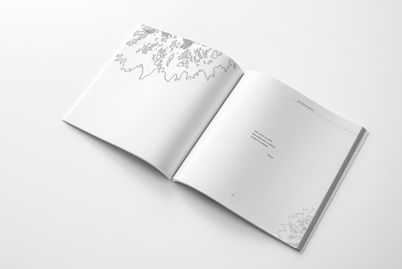

I'm glad to present here the typographic design of the collection of Japanese poetry. I took Japanese medieval poetry, then divided it into schools, and made special illustrations. The main aim was to show how the haiku beauty can be complemented by illustrations, keeping rhythm and integrity wherein. The nature of the images is different, just like the mood of the tercets. It can be as gentle and aerial overflows, as clear contours and contrasting elements. This very combination allows to achieve a rhythm.
The book is designed in black and white; this artistic solution, in my opinion, is most consistent with the minimalistic art of Japan. In addition, without using bright colors, you can achieve a great interesting, stylish and graphic effect.
The work was based on the main principles of the Japanese aesthetic worldview: wabi-sabi (modesty, loneliness, genuineness), yugen (intuitive, implicit,) and mono no aware (sad charm of things, state of natural harmony). Hope you enjoy this project, thank you for your attention!


